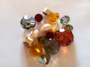
The trick to designing jewelry is to make your product fashion forward. This means that we are predicting the future trends in clothing and accessories so that the new jewelry you get from Karen Curtis is going to be a beautiful accent to your wardrobe. This doesn’t mean we want matchy-matchy, it means that we can add more color to your outfit by blending it to what you are wearing. One of the most popular collections that we made, for last year was titled “port side”, it was based on a nautical theme. Using navy blues, and chalk-white as the major components, while mixing in tan and champagne colors to help tie it in with everyday clothing such as khakis or a large neutral colored sun hat. See example below. Now the first step we take is to put together a grouping of colored Swarovski Elements just to see how the colors look together. The amount of each color can be moderated by the size of the beads we use in a specific item, that being said lets take a look at a group of beads Karen put together that we are going to use for this years designs.
The look is very natural. Mainly honey tones and adding accent colors that are darker then the amber tones will help to give “pop” to the piece. The shapes play a huge roll in the overall design. Smaller accents colors compliment the big, bold amber tones that are really going to define the piece.
Next week I will post the final product…. stay tuned!
Leave a comment